Do you know about Pivot Tables?
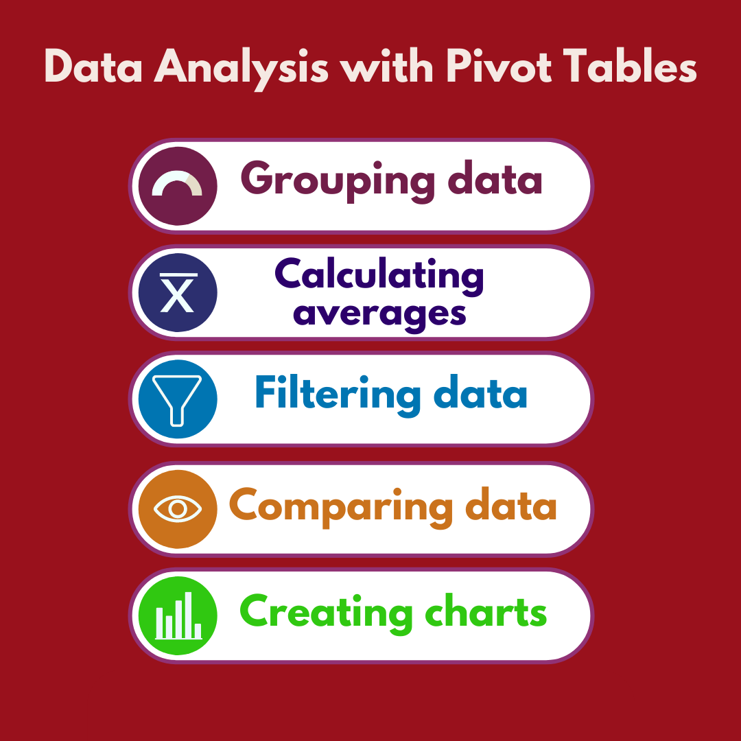
Pivot Tables is a great tool in excel. It helps prepare reports and get insights from huge data sets with just a few clicks. It can help summarize data, reorganize data, group, sort and filter data quickly.
If we have a large data set and want to get quick insights, it is important to know the Excel Pivot Table function.
Let us learn a few features of Excel Pivot Table in this article.
Before inserting a Pivot table, you need to ensure that the data is in proper format.
- The data set should not have any empty rows/ columns
- All the columns in the data set should have headers
- There are no totals/ sub totals in between
Once you ensure that all the three conditions are met. Your data set is good for the Pivot table.
How to insert Pivot Tables?
Here we have a data set showing monthly sales by regions and person. The data extends till row 888. We want to create a report showing sales by regions and salesperson.
Creating reports with Pivot Tables
To insert a Pivot table, click anywhere on the data, Go to the Insert tab and click Pivot table. You get the below dialogue box.
The table range is automatically selected.
It again asks if the Pivot table report is to be placed in the New worksheet or existing worksheet. We have selected new worksheet. Then click on OK.
Once you click on OK. You get a Pivot table set up in another sheet.
On top you have the pivot tables fields. The field names are the headers of the data set (Journal, Month, Salesperson etc. in our example). This is the reason why we should have a header for each column in the data set. Below is the area for the fields we want to see in our Pivot table.
You must drag the fields to the relevant section (rows, columns, values etc.) based on the type of report you want to create.
For example, if you drag the region in the rows section and revenue in the Values section, you get the following report.
Similarly, if you want to see the sales by region and salesperson, just drag the Salesperson field in the column section. You get the following table.
If you want to get the sales by month, drag the month in the filter section.
You can select the month from the drop-down list.
This is how we can summarize the data with the help of Pivot table.
Pivot Tables Report Formatting / Structure
Number formatting
To change the number format, Right click on the pivot table and Select Number Format and choose the format you want. You can insert/remove decimals, insert 1000 separator, convert to percent etc.
Field Headers
To remove the field headers, Click on the Pivot Table and select Pivot Table Analyze Tab. Then Deselect Field Headers.
The row label and Column label description gets removed from the Pivot table (See below).
Pivot Tables Design
To change the design of the table, click on the Pivot table , then go to the design tab and select the design from multiple options available .
Grand Totals
The default Pivot table has Grand Totals both in rows and in columns. We have the option to remove either or both.
To add or remove Grand Totals Click on the Pivot Table so that the Design Tab gets activated. Click on theDesign tab, Then Click on Grand Totals and select the relevant option for your report.
Sorting Data
If you want to sort the data by regions, just right click on the Pivot Table and select Sort data.
Values
The default value in the Pivot table is Sum of total sales made by each salesperson by region. In case we want to change it to average sales, just right click on the Pivot Table and select Summarize Values by option. You get a range of options- Sum, Count, Min, Max, Average etc. You can select the option based on your requirement.
If instead of total revenues, you want to show the revenues by %, Right click on the table and Select Show Value As option. You can select from the list of available options – % of Grand Total, % of Row Total, column Total etc.
Changing the layout of the Pivot Tables
If we want to change the layout of the Pivot Table, just click on the table and then in Pivot Table fields, make the changes you want. For example, if we want to see the revenues by regions and salesperson in rows, drag the salesperson field from Columns section to Rows section. Your table will appear as follows.
Have your read our blog Waterfall Charts in Excel
Slicer
Pivot table slicer is a tool to filter data and make the Pivot Table report interactive. To insert a Pivot Table slicer, Click on the Table. Then Go to PivotTables Analyze Tab. Select Insert Slicer.
You get an insert Slicer Dialogue Box. Choose the relevant option.
In this example, I am selecting the Salesperson. Then Click OK. We get the Slicer besides out Pivot Table. We get the full list of Salesperson. The Pivot Table data gets filtered based on the chosen option.
Data Update for future reports
In case there is any change in the Pivot Table source data, the Pivot table does not get updated automatically. Right click on the table and then click on Refresh so that the changes in the data get reflected in the table.
Conclusion
This is how we can prepare interactive reports using Pivot table feature in Excel. If you like playing with Data sets, pivot table is a great tool. For you to get a good understanding just keep exploring the different features of the Pivot table. It will help you further enhance your data analysis skills in excel.


8 thoughts on “Data Analysis and Reporting with Pivot Tables: Tips and Examples”
[…] with one column containing all of the monthly income brackets. In the next column, we would add a pivot table in excel that contains the count of people for each income […]
[…] modeling functions you need to know in Excel are: Goal Seek, Solver, What-If Analysis, Data Table, Pivot Tables, and Scenario Manager. These six powerful tools will allow you to model many different scenarios […]
[…] analysis. A financial analyst must be adept in Excel analytics like formatting, V-lookup, H-lookup, pivot tables and valuation equations. Proper knowledge of Excel shortcuts help to save time and build financial […]
The point of view of your article has taught me a lot, and I already know how to improve the paper on gate.oi, thank you.
this is easy and simple to follow
I am extremely impressed with your writing skills and also with the layout on your weblog. Is this a paid theme or did you customize it yourself? Anyway keep up the excellent quality writing, it?s rare to see a great blog like this one nowadays..
Heya! I just wanted to ask if you ever have any problems with hackers? My last blog (wordpress) was hacked and I ended up losing a few months of hard work due to no data backup. Do you have any methods to prevent hackers?
Can you be more specific about the content of your article? After reading it, I still have some doubts. Hope you can help me.